AthletiQ
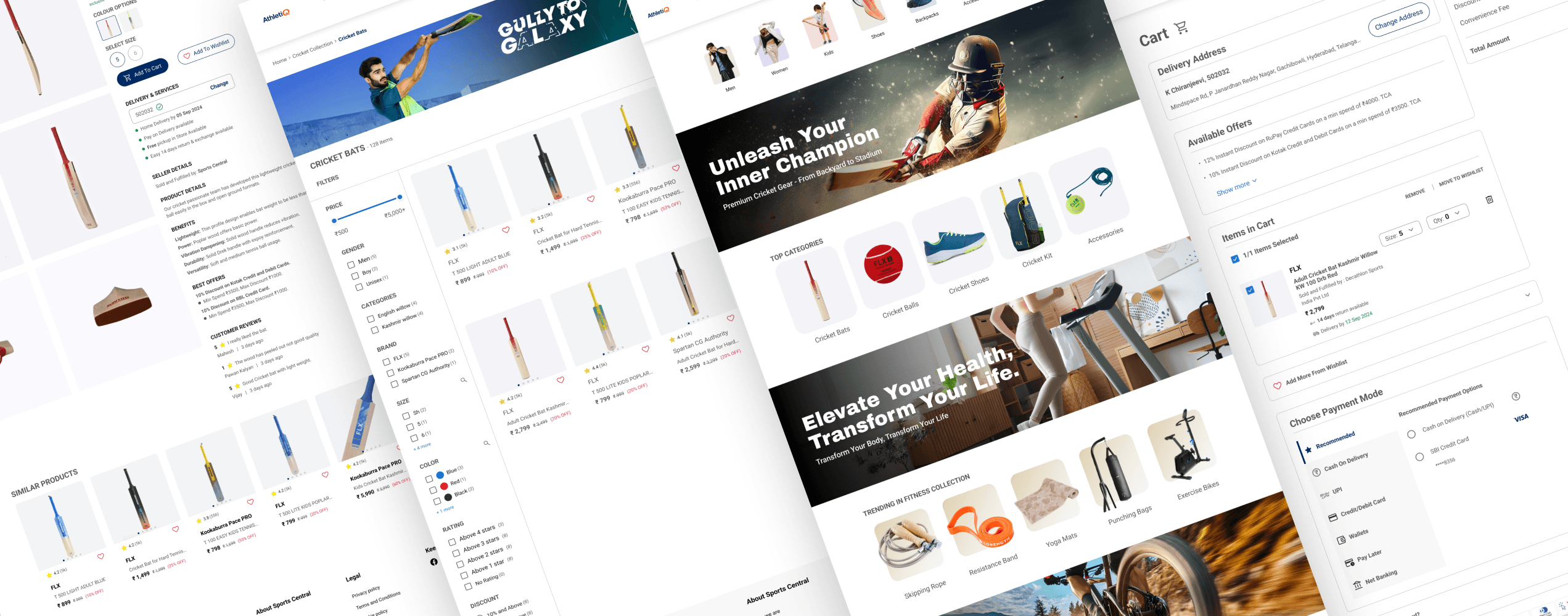
Figma Prototype
Check out my interactive Figma prototype by clicking the link below.


Redesign a sports e-commerce platform that offers an intuitive, engaging, and accessible shopping experience.
AthletiQ aims to improve product discoverability, elevate visual hierarchy, and streamline the shopping journey for athletes and sports enthusiasts.


Says
It takes too long to find the product I need. There’s too much going on — it feels messy. I wish the filters actually worked properly. I'm not sure if I can trust these reviews. Why doesn’t the product page show delivery info clearly?

Thinks
Why are similar items showing in completely unrelated sections? Am I being shown fake offers or unclear discounts? This payment process feels risky and cluttered.

User
John, 27, is a tech-savvy software engineer from Hyderabad. With a busy work schedule and active lifestyle, he prefers fast, efficient desktop shopping for fitness gear during breaks or late evenings.

Does
Before: Thinks about what he needs (e.g., a cricket bat, skipping rope).
During: Applies filters but resets them often.
After: Often abandons the purchase midway.

Feels
😩 Overwhelmed by the interface and endless options.
🤔 Distrustful of product quality due to unclear information.
😐 Disconnected — the site doesn’t feel tailored to fitness enthusiasts.
😓 Anxious during checkout unclear pricing, poor payment validation.

Problem Statement:
Based on the user research and empathy mapping, I distilled the problem into key opportunity areas:
How Might We...
Help users find the right products faster?
Build trust through clean presentation and transparent reviews?
Reduce friction in checkout with better feedback and clarity?

Cluttered Listings
Overwhelming product grid with basic filters and low personalization.

Visual-First, Low Utility
Premium look, but lacks helpful and easy product comparison.

Feature Overload
Lots of options, but visually noisy and difficult to compare items.

Clean & Guided UX
Assistive filters, visual clarity, and minimal UI lead to faster decisions.
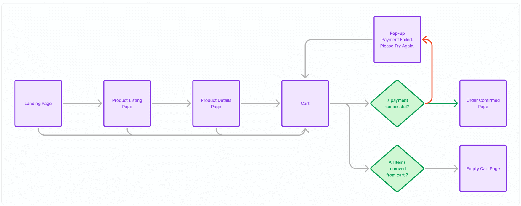
Flow Diagram
I began by mapping out the core shopping flow for AthletiQ — from homepage entry to product discovery, comparison, and checkout.
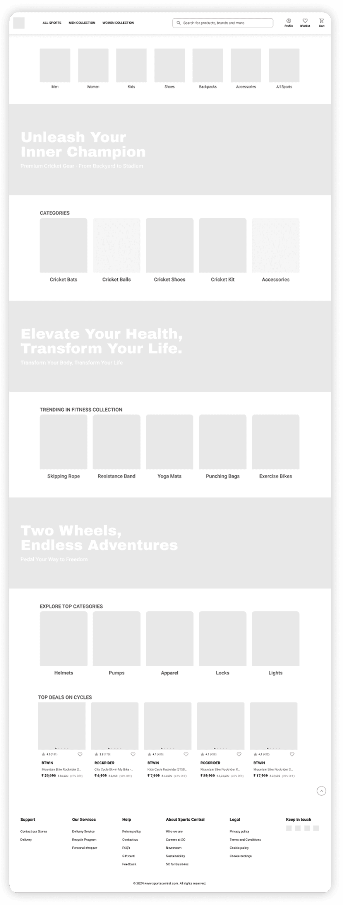
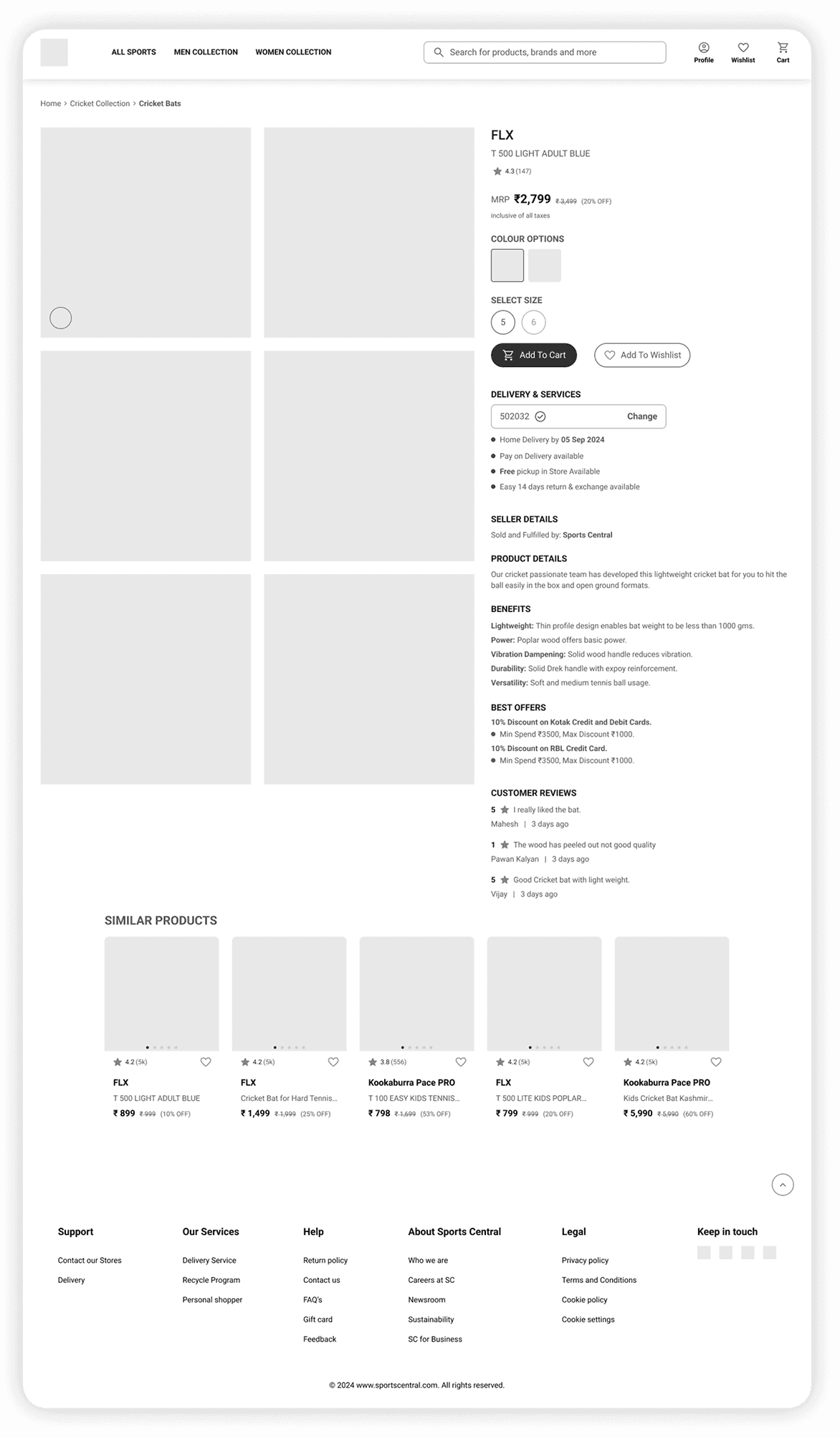
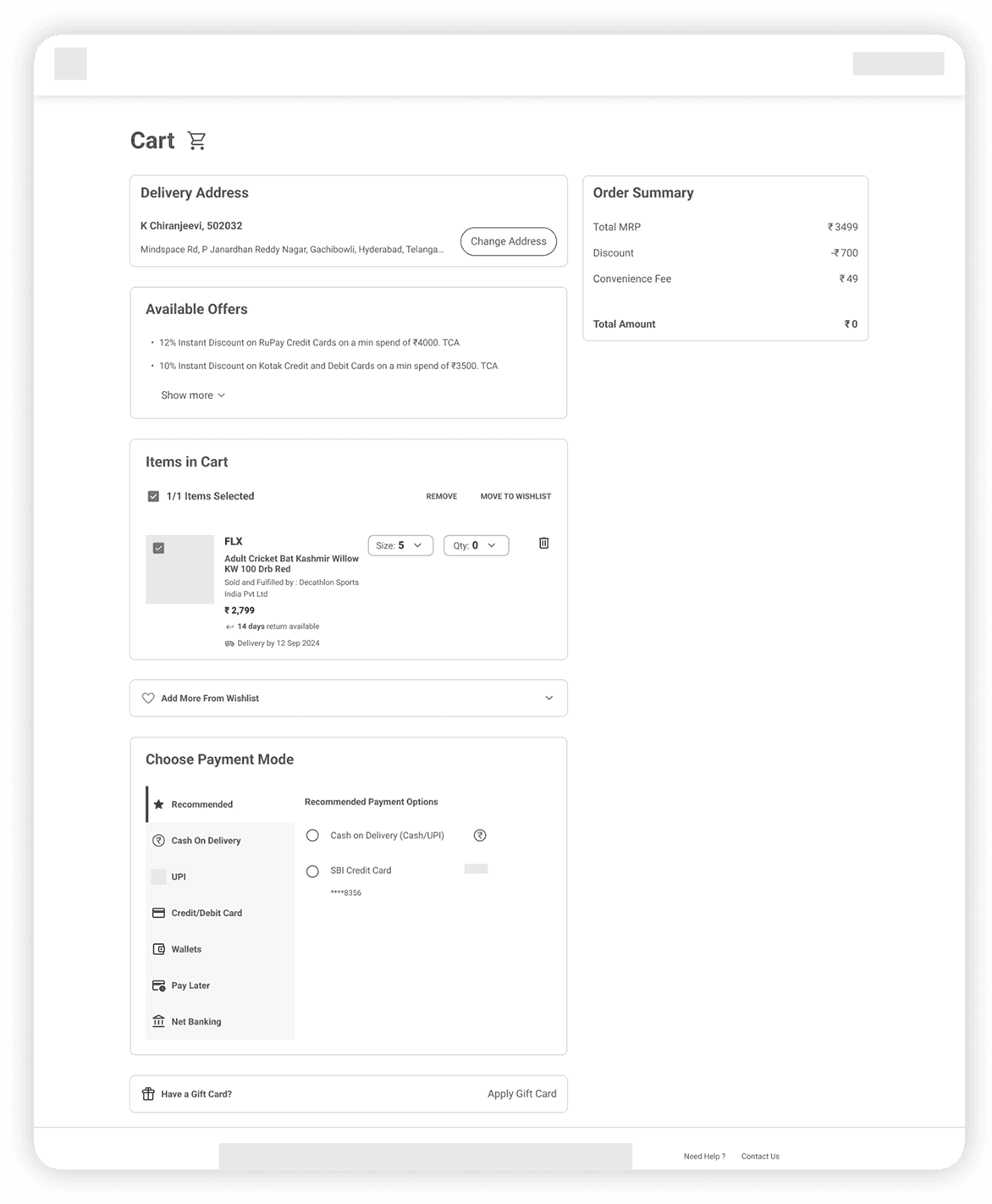
I started with low-fidelity wireframes to focus purely on layout and structure without the distraction of color or branding.
These wireframes helped clarify visual hierarchy, align CTA placement with user flow, and define content priorities across the product listing, detail, cart, and confirmation screens.



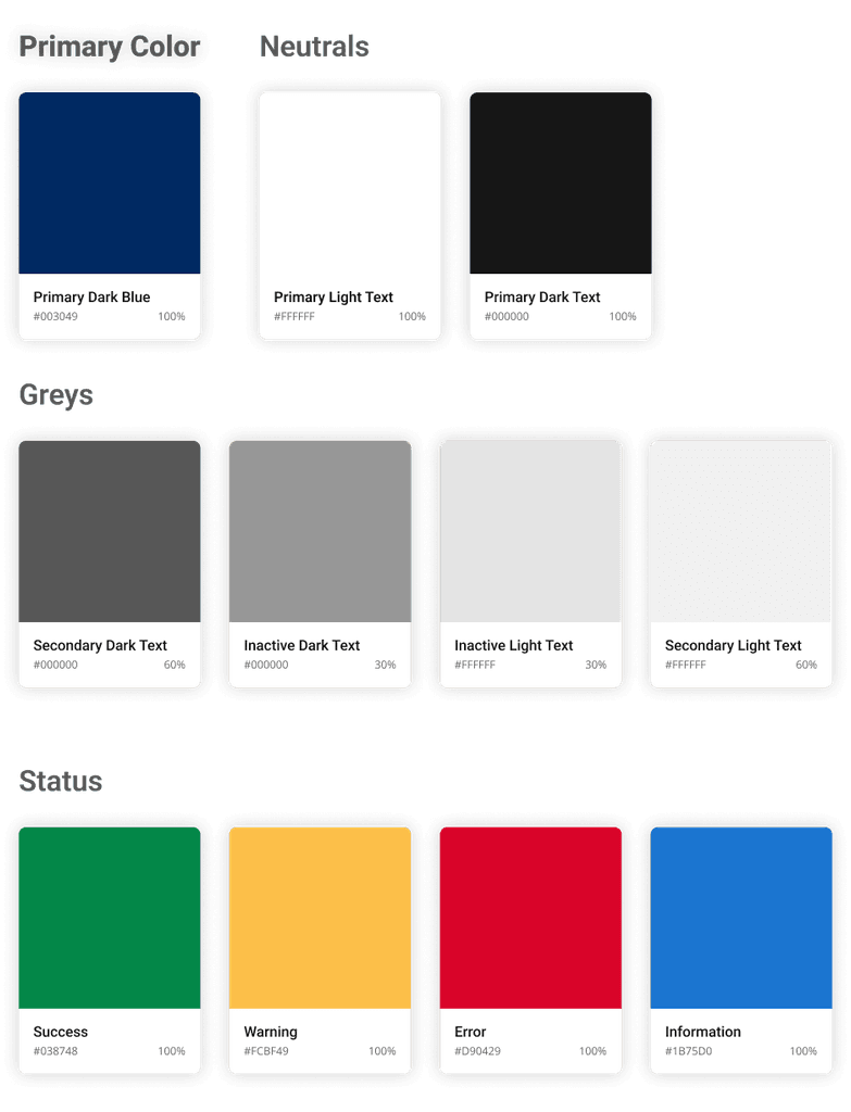
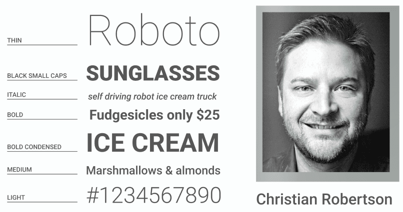
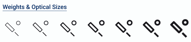
AthletiQ uses the Roboto typeface for its modern, legible structure and digital-optimized rendering.
Available in multiple weights from Thin to Black
Excellent legibility for product details and pricing
Clean, neutral tone that aligns with AthletiQ’s functional and professional voice
Familiar across e-commerce platforms, increasing readability and user comfort

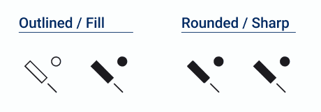


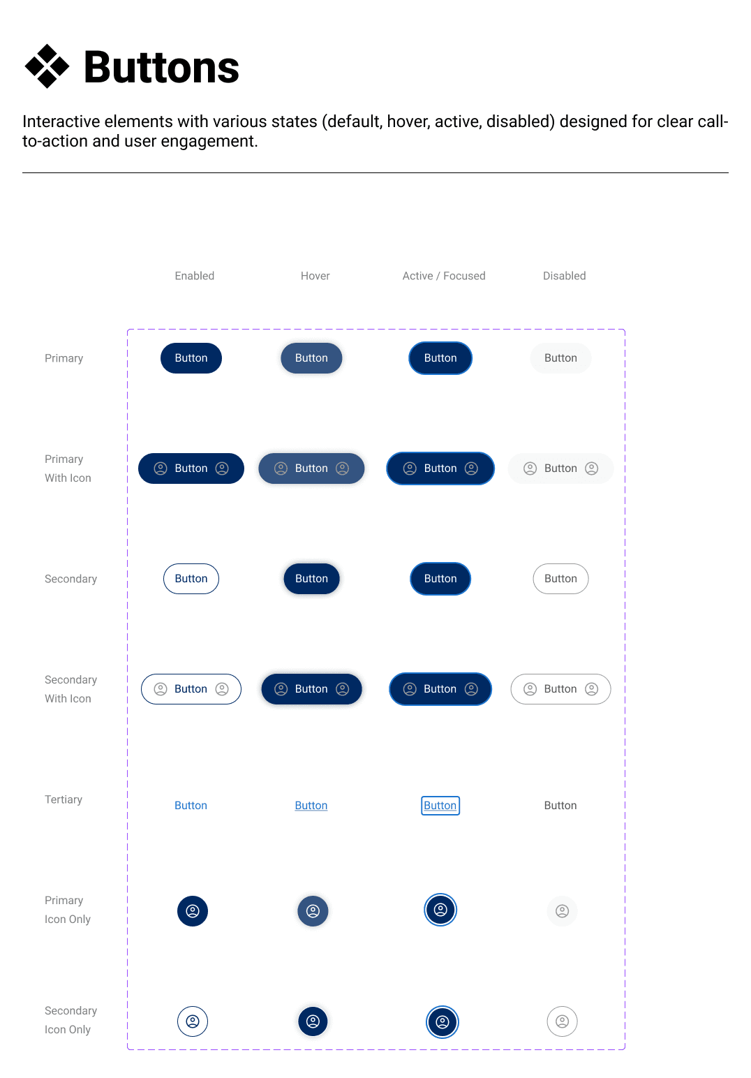
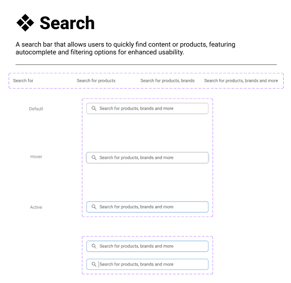
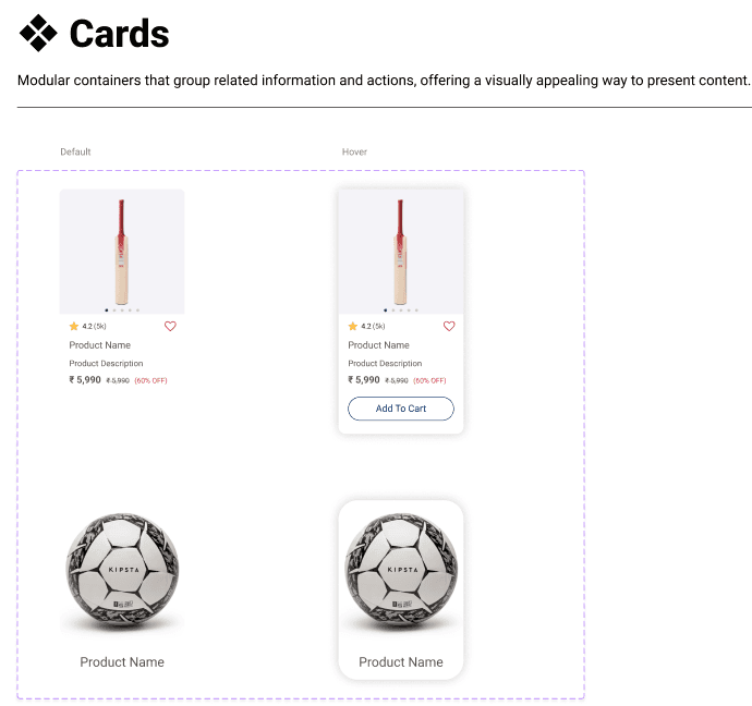

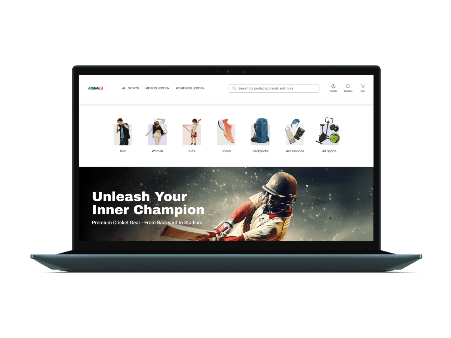
Explore how users interact with AthletiQ through an end-to-end prototype built in Figma.
Key flows include:
Product discovery & filtering
Add to cart
Address & payment input
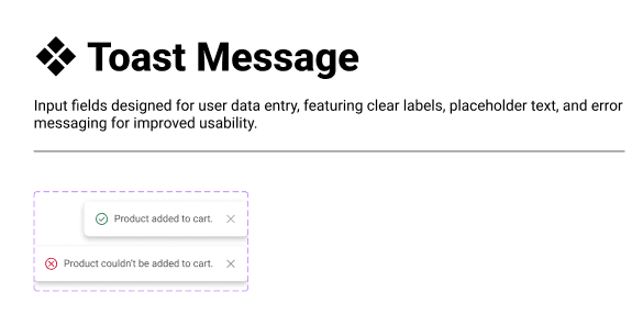
Confirmation feedback
This prototype showcases the experience from homepage to successful purchase — with smooth transitions and assistive UI cues throughout.
🖼️ Final UI Mockups
AthletiQ’s final design delivers a seamless shopping experience across screens. Each screen is structured for clarity, with a visual hierarchy that emphasizes product exploration, easy comparison, and frictionless checkout — whether on desktop or mobile.
🧠 Reflection & Learnings
Figma Prototype
Check out my interactive Figma prototype by clicking the link below.