




Project Overview
The product:
The objective of this project is to reimagine the MyGHMC (Greater Hyderabad Municipal Corporation) mobile application to enhance user experience and address common pain points faced by residents of Hyderabad when interacting with municipal services.
The problem:
The MyGHMC app suffers from poor design, confusing navigation, accessibility challenges, and inconsistent iconography. These issues make it difficult for users to interact with the app effectively, leading to frustration and low engagement.
The goal:
To transform the MyGHMC app into a user-friendly, accessible, and visually compelling experience. This includes a complete UI redesign, integrating an AI-powered chatbot for quick assistance, and adding a smart search bar with suggested chips to help users find services faster.
My role:
Led the end-to-end redesign of the MyGHMC mobile app as a UI/UX Designer, translating complex civic workflows into intuitive digital experiences.
Responsibilities:
Conducted user research, identified pain points, created wireframes and high-fidelity visuals, and built interactive prototypes to streamline usability and drive engagement.
Design Thinking Process

Empathize
I began by conducting user interviews, reviewing app store feedback, and observing how citizens interacted with the MyGHMC app. This helped uncover deep frustrations and accessibility issues users faced while registering civic complaints.
Define
From research insights, I created an empathy map, built the persona of Ajay Kumar, and defined key pain points. I then crafted focused problem statements to guide solution-building with clarity and intent.
Ideate
I analyzed competitors like MyBMC and NDMC 311, ran “How Might We” exercises, and rapidly sketched ideas like an AI chatbot, smart search with suggestive chips, and a visual progress tracker for complaint filing.
Prototype
I translated ideas into lo-fi wireframes, designed user flows, and created clickable prototypes. I prioritized accessibility and minimal design to ensure simplicity for all user types.
Test
I conducted usability tests to gather feedback on the prototype. Based on insights, I refined UI components, improved icon consistency, and adjusted chatbot placement to better support users during tasks.
Implement
I transformed refined wireframes into high-fidelity designs with consistent branding, strong visual hierarchy, and an engaging AI chatbot interface, ensuring the redesign was ready to deliver real impact to Hyderabad citizens.
Empathize
User Research
User Interviews
Goal: To gather insights into the user's experience with registering complaints on the MyGHMC app and their expectations for an AI chatbot to assist in the process while enhancing both the visual design and overall user experience.
Closing: Thank you for sharing your thoughts! Your feedback will be invaluable in creating an app that meets the needs of users like you.
Play-Store reviews key insights:
• “Why is a mobile number mandatory just to log in?”
• “Only users can mark a complaint "closed", GHMC staff should confirm resolution.”


Competitor Analysis
Click here to view the Competitor Analysis Excel sheet
Empathy Map
Who/Situation
User Description: The user is a Software Engineer familiar with mobile apps and technology, providing valuable insights from both UI and UX perspective.
Situations/Context: They have used the MyGHMC app for registering complaints or paying property tax but only rarely due to the app's inefficiency and poor design.
Says
Positive Comment: The MyGHMC app lets Hyderabad citizens raise civic complaints, pay municipal taxes, and access GHMC services in one place.
Negative Comments:
The MyGHMC app’s UI design is poor and confusing:
Duplicate services buttons appear on both the home page and the side navigation.
Inconsistent icon sizes and weights.
Accessibility is "messed up."
Design feels cluttered and lacks proper visual hierarchy.
Thinks
The app’s visual design needs improvement for clarity and ease of use.
Additional features like progress indicators, clearer buttons would enhance the complaint registration process.
A chatbot integrated in every screen would be helpful, enabling users to get guidance without leaving the current screen.
Consistent icons and minimal design could improve intuitiveness and accessibility.
Does
Before:
Users occasionally log in to the app when they need to register a complaint or grievance.
They prepare some information about their complaint like the images related to the complaint etc.
During:
They attempt to register their complaints but face frustration with confused navigation and inconsistent design.
After:
Users might abandon the process due to confusion or lack of assistance.
They may prefer other channels (e.g., in-person grievance reporting) over using the app.
Feels
Frustrated:
The current app’s design and navigation are confusing and boring to use.
Lack of guidance during complaint registration adds to the frustration.
Hopeful:
The user believes the app could be significantly improved with better visual design and AI chatbot integration to assist users effectively.
Engaged:
They appreciate the potential for an intuitive and user-friendly redesign, especially with consistent icons, accessibility improvements, and an engaging chatbot.
This empathy map highlights the user’s pain points, needs, and expectations, forming a strong foundation for crafting a user-centric design.
Pain Points
1. Unintuitive Interface: Many users found the interface unintuitive and cluttered, leading to confusion and frustration.
2. Complex Navigation: Users reported difficulty in finding specific services or information due to poor navigation structure.
3. Poor Accessibility: The app was not fully accessible to users with disabilities, with issues such as small text sizes and lack of voice assistance.
4. Inconsistent Design Elements: Inconsistencies in font sizes, colors, and button styles made the app look unprofessional.
Define
Problem Statement
Ajay Kumar is a software engineer who needs an intuitive, visually appealing app to register complaints on the MyGHMC app seamlessly because the current app design is cluttered, inconsistent, and lacks clear guidance, making the process frustrating and inefficient.
Affinity Mapping
Cluttered & Inefficient Design
Home screen feels crowded.
Duplicate buttons (side nav and bottom tabs).
Confusing layout causes user hesitation.
OTP and login issues under weak mobile network.
Inconsistency & Poor Visuals
Icons vary in style and weight.
Inconsistent button placement.
Accessibility issues with font and colors.
User Persona
Demographics
Name: Ajay Kumar
Age: 33
Education: Bachelor’s in Computer Science.
Hometown: Hyderabad, India
Family: Lives with his spouse and a pet dog
Occupation: Software Engineer with 10+ years of experience in app and website design

User Story
As a Hyderabad citizen, I want to easily register complaints through a visually appealing and intuitive civic services provider app with AI chatbot assistance so that I can save time, avoid frustration, and have a seamless experience resolving issues efficiently.
Storyboard
1. Pothole encounter

2. Capturing a photo

3. Raising a complaint

4. Pothole Repair in Progress

5. Notified the status of repair

6. Smooth ride to office

How-Might-We Statements
Bad Design
Problem: The design is outdated and not visually appealing.
HMW: How might we redesign the interface to make it more modern, engaging, and user-friendly?
Navigation Issues
Problem: Users struggle to find services easily.
HMW: How might we simplify navigation to ensure users can access services with fewer taps?
Accessibility Issues
Problem: Limited support for users with disabilities.
HMW: How might we ensure the app is accessible to people of varying abilities, including those with disabilities?
Lack of In-Flow Guidance
Problem: Users get stuck mid-form with no step-by-step help.
HMW: How might we integrate an in-context chatbot or guided tour that walks users through each complaint step?
Ideate
Brainstorming - Problems & Possible Solutions
|
|---|
Possible Solutions: Users must have multiple sign-in options.
|
|---|
Possible Solutions: Context aware chatbot help.
|
|---|
Possible Solutions: App should be WCAG-compliant, add ARIA labels, screen reader functionality and navigation via switch access.
Key Problem: Complaint getting closed with out resolution.
Possible Solutions: Only users should be able to close the complaint.
Information Architecture

User Flow

Prototype/Design
Visual Design
Brand Identity
Typography
Font Family: Inter
Rationale:
Inter is a modern, versatile, and highly legible sans-serif typeface, perfect for both display and body text.
Its geometric structure with a slightly organic touch makes it suitable for digital interfaces.
Excellent readability on mobile devices, especially at smaller sizes, and optimized for user interfaces.
Free to use and widely supported across platforms.

Colors

The primary color green was chosen to reflect civic trust, growth, and alignment with the Telangana government’s identity. It draws directly from the official emblem’s green seal, ensuring visual continuity and local cultural relevance.
Secondary, tertiary, and neutral tones were selected to maintain contrast, accessibility, and a balanced civic UI.
All color values are managed through Figma variables for consistent theming, accessibility contrast, and component reuse.

Iconography
Material Design Icons
The MyGHMC app redesign uses icons from the official Material Symbols library to maintain visual consistency, clarity, and accessibility.
These icons follow Google’s Material Design guidelines for size, weight, and padding, ensuring they remain familiar and intuitive for users. Icon sets include Outlined and Filled variants depending on context.
Icons are scalable, screen-reader accessible via aria-label, and match the 24 × 24 px grid for pixel-perfect alignment.

Design System
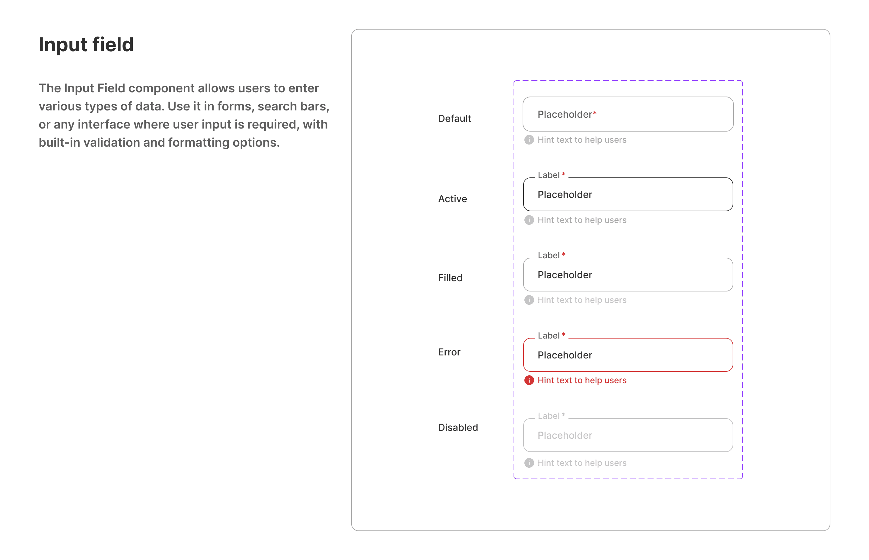
Color variables

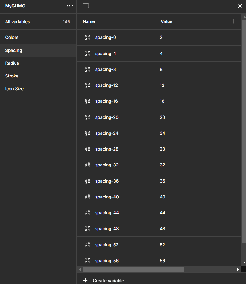
Spacing variables
Radius variables

Stroke variables

Icon Size variables

Component library

High-Fidelity wireframes
Digital wireframes made it easy to understand how the redesign could help address user pain points and improve the user experience. Prioritizing useful button locations and visual element placement on the home page was a key part of my strategy.

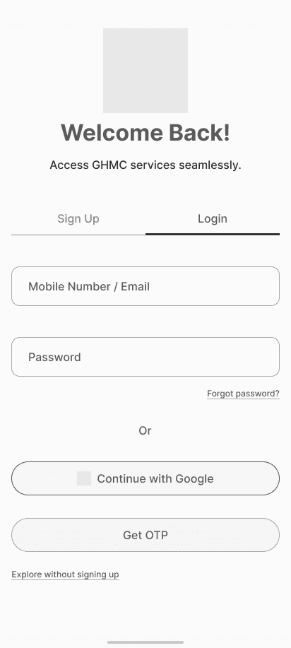
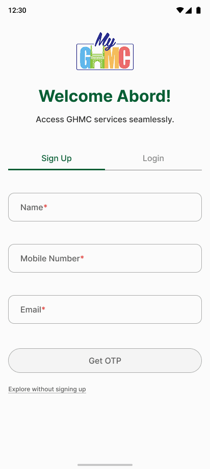
Why include Email in the Signup form?
In the original app, the signup process did not collect the user's email. However, I added this field as a thoughtful UX enhancement. Imagine a scenario where the user tries to log in but has poor mobile signal and cannot receive the OTP. By capturing the email during signup, the app provides an alternate login method, ensuring users can still access their account when mobile number verification fails. This improves accessibility, reliability, and reduces friction in critical moments.

The original home screen was cluttered and hard to navigate. I redesigned it to feel clean, personalized, and focused.
Key Improvements:
1. Personalized greeting with relevant alerts.
2. Smart search bar with voice and chip suggestions.
3. Clean service categories like Grievances and Licenses.
4. Fewer icons, more clarity.
5. AI chatbot.
Prototype
View the redesigned MyGHMC High-Fidelity Prototype


Test
Usability study: findings from current app.
Search Confusion
Users struggled to locate services due to poor icon hierarchy and lack of search assistance.
Lack of Support
There was no clear way to ask for help or understand complex tasks, especially for first-time users.
Visual Overload
The interface was cluttered with inconsistent icons, making the experience visually overwhelming.
Lack of Personal Focus
The homepage didn’t prioritize relevant services, alerts, or personalization, which diluted the user’s attention.
Limited Discoverability
Users were unaware of other useful government services due to poor app-to-app visibility.
Refining the design Mockups
Improvement 1: Smarter Search with Voice & Suggestions
Before usability study:
Users had no clear way to locate services. The homepage was overcrowded with icons, leading to confusion and long scrolling.

After usability study:
I added a search bar with voice input and smart chips to help users quickly find services based on intent.

Impact: Made key services like Property Tax and Grievances easier to access, especially helpful for users with limited time or tech skills.
Improvement 2: AI Chatbot for Instant Assistance
Before usability study:
The app lacked support guidance. Users were unsure how to proceed with complex tasks like registering a complaint.
After usability study:
I introduced a contextual AI-powered chatbot that floats on every screen. It offers real-time help, guided flows, FAQs.

Impact: Reduced confusion, increased task completion, and made the app more inclusive for all users.
Improvement 3: Visual Hierarchy & Personal Focus
Before usability study:
The interface was cluttered with inconsistent icons and lacked personalized focus, making navigation overwhelming.
After usability study:
I replaced icons with image-based cards, introduced personalized greetings, and prioritized relevant sections like Grievances and Property Tax.
Impact: Created a more intuitive and modern experience that helps users focus on what matters most.
Improvement 4: Better Discoverability of Govt. Services
Users were unaware of other useful Telangana govt. and Indian govt. apps due to a lack of visibility or nudges.
After usability study:
I added two clear sections, “Other Apps from Telangana Govt.” and “Other Citizen Apps” with cards and logos to nudge exploration.

Impact: Encouraged users to discover and benefit from additional e-Governance tools beyond just MyGHMC.
Accessibility considerations
High-Contrast Color Scheme
Used clear contrast between background and text (e.g., dark text on light backgrounds) to improve readability, especially for users with visual impairments.
Voice Input & Smart Suggestions
Enabled voice input in the search bar to support users with limited mobility or digital literacy.
Touch-Friendly Targets
Designed large buttons and cards for easy tap access on mobile devices, aiding users with motor difficulties.
AI Chatbot with Natural Language Support