MyGHMC
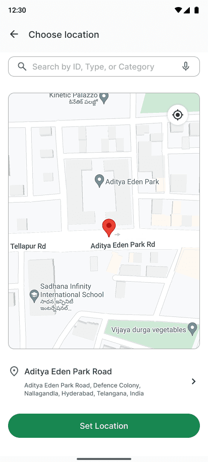
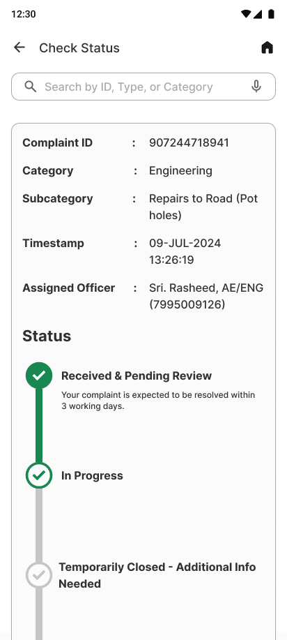
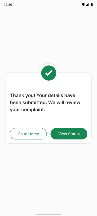
Project Overview
The product:
The objective of this project is to redesign the MyGHMC (Greater Hyderabad Municipal Corporation) mobile application to enhance user experience and address common pain points faced by residents of Hyderabad when interacting with municipal services.
The problem:
The MyGHMC app suffers from poor design, confusing navigation, accessibility challenges, and inconsistent iconography. These issues make it difficult for users to interact with the app effectively, leading to frustration and low engagement.
The goal:
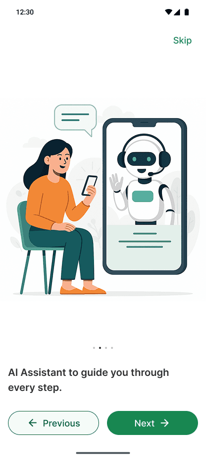
To transform the MyGHMC app into a user-friendly, accessible, and visually consistent experience. This includes a complete UI redesign, integrating an AI-powered chatbot for quick assistance, and adding a smart search bar with suggested chips to help users find services faster.
My role:
Led the end-to-end redesign of the MyGHMC mobile app as a UI/UX Designer, translating complex civic workflows into intuitive digital experiences.
Responsibilities:
Conducted user research, identified pain points, created wireframes and high-fidelity visuals, and built interactive prototypes to streamline usability and drive engagement.
Understanding the user
User research
Summary
User interviews revealed that the MyGHMC app feels visually cluttered, difficult to navigate, and suffers from inconsistent iconography. Common frustrations included a confusing complaint registration flow and poor accessibility. Users recommended streamlining navigation, enhancing performance, and redesigning the interface for better clarity and usability. There was also strong interest in an AI chatbot—ideally accessible on every screen via a bottom sheet—to guide users, answer questions, and assist with filing complaints more efficiently.
Pain points
1. Unintuitive Interface: Many users found the interface unintuitive and cluttered, leading to confusion and frustration.
2. Complex Navigation: Users reported difficulty in finding specific services or information due to poor navigation structure.
3. Poor Accessibility: The app was not fully accessible to users with disabilities, with issues such as small text sizes and lack of voice assistance.
4. Inconsistent Design Elements: Inconsistencies in font sizes, colors, and button styles made the app look unprofessional.
Persona
Ajay Kumar
A 35-year-old Software Engineer from Hyderabad with 10+ years of experience. Ajay expects clean, accessible, and well-structured apps that respect user time and intelligence.
Ajay tried reporting a pothole on the MyGHMC app—but gave up due to the cluttered UI. He envisions a redesigned app powered by clear visuals, a helpful AI chatbot, and frictionless navigation.
Goals:
Easily access and navigate municipal services through the app.
Quickly report civic issues like potholes or garbage problems.
Receive timely updates on complaint status.
Use a frustration-free interface.
Pain Points:
Confusing layout and duplicate navigation.
Frustrating complaint registration process.
No real-time feedback or assistance.
Poor accessibility and lack of guided help.
Quote:
“I just want to get things done—without tapping endlessly or guessing where to go.”
Needs:
A cleaner, intuitive app design with consistent UI.
A smart search bar with voice input for faster access.
An AI-powered chatbot to provide instant guidance and answers.
Real-time status tracking and contextual help throughout the app.
User Journey Map
| Action | Task List | Feeling Adjective | Improvement Opportunities |
|---|---|---|---|
| Locating the Reporting Feature | A. Open the MyGHMC app. B. Navigate through the home screen and menu options. C. Search for the section to report a civic issue. | Confused | A. Simplify the navigation structure to make key features easily accessible. B. An AI-powered chatbot to provide instant guidance and answers. C. Implement a search bar to quickly find specific services. |
| Filling Out the Report Form | A. Enter details about the pothole. B. Attach a photo of the issue. C. Provide location information and any additional comments. | Frustrated | A. Streamline the form to reduce the number of required fields. B. Add autofill options for location using GPS. C. Ensure the form is responsive and user-friendly across devices. |
| Submitting the Report | A. Double-check the entered information. B. Click the submit button. C. Wait for confirmation that the report has been submitted successfully. | Impatient | A. Optimize the app's performance to reduce submission times. B. Provide a progress indicator to show the submission status. C. Send immediate confirmation notifications upon successful submission. |
| Checking for Updates | A. Open the app regularly to check the status of the report. B. Navigate to the complaints section. C. Look for any updates or notifications related to the reported issue. | Anxious | A. Implement real-time updates and push notifications to inform users of status changes. B. Create a dedicated dashboard for tracking submitted reports and their statuses. C. Enhance transparency by providing estimated timelines for issue resolution. |
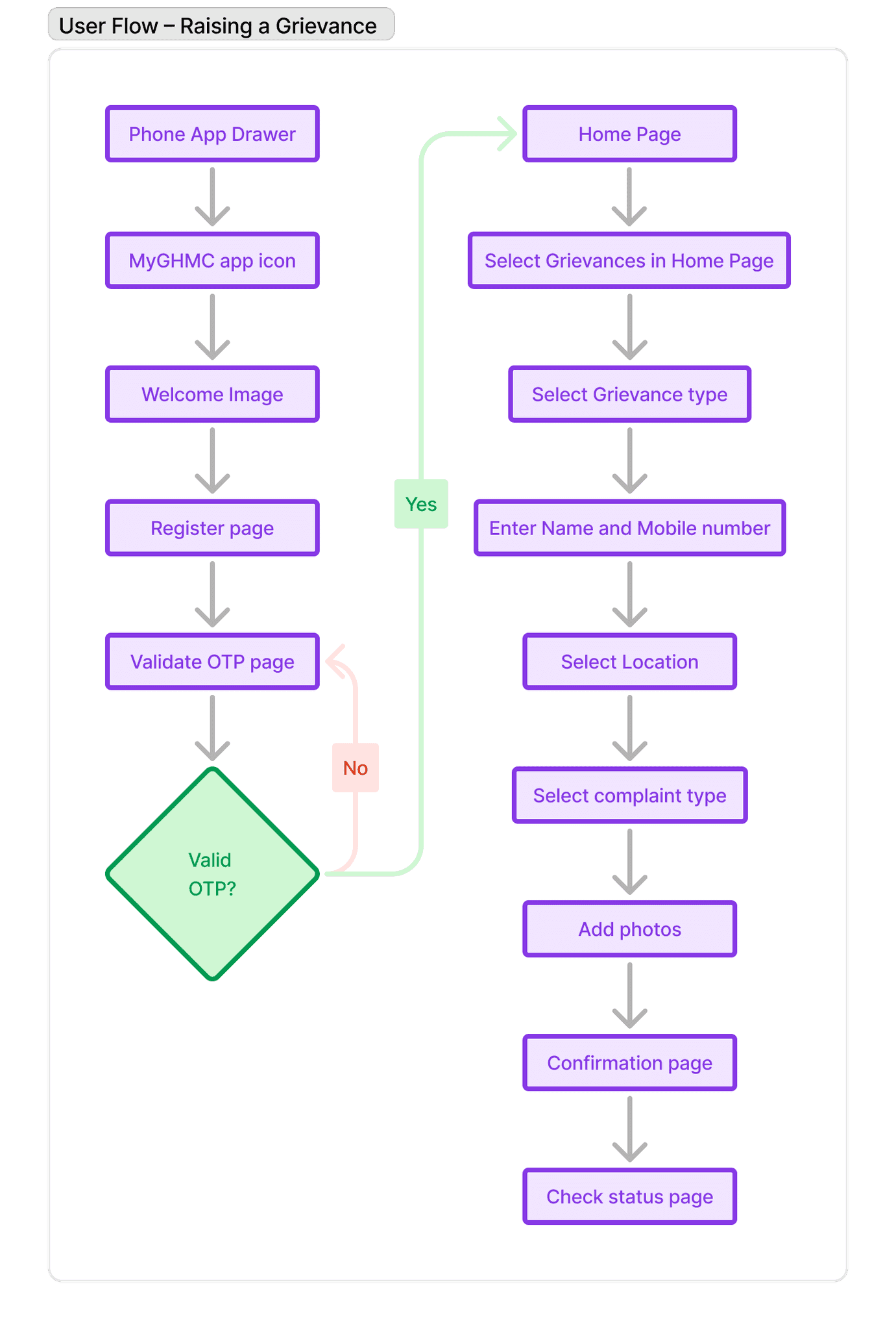
Starting The Design
Sitemap
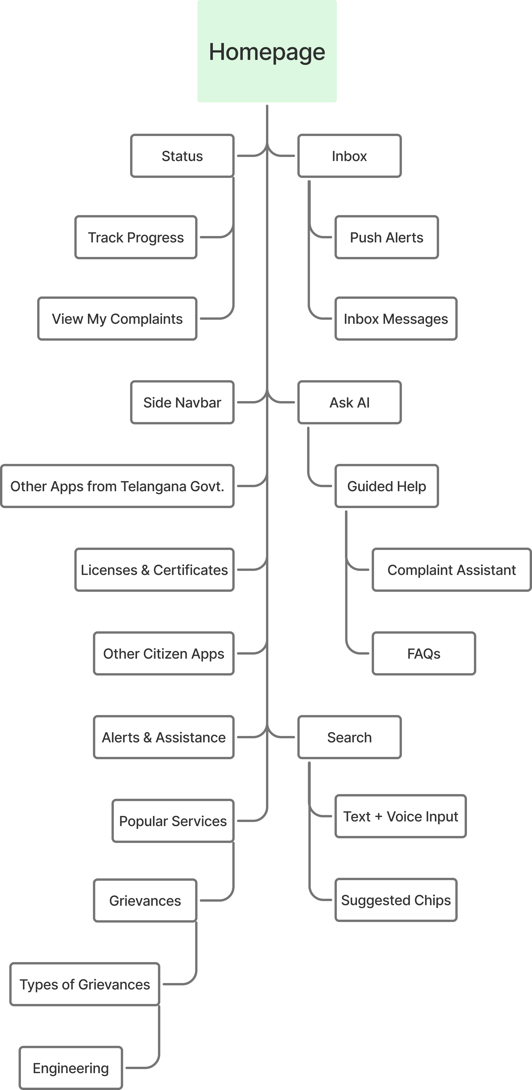
Difficulty with website navigation was a primary pain point for users, so I used that knowledge to create a sitemap. My goal here was to make strategic information architecture decisions that would improve overall website navigation. The structure I chose was designed to make things simple and easy.
Digital wireframes
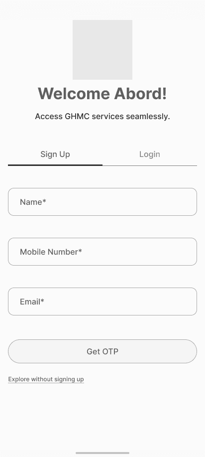
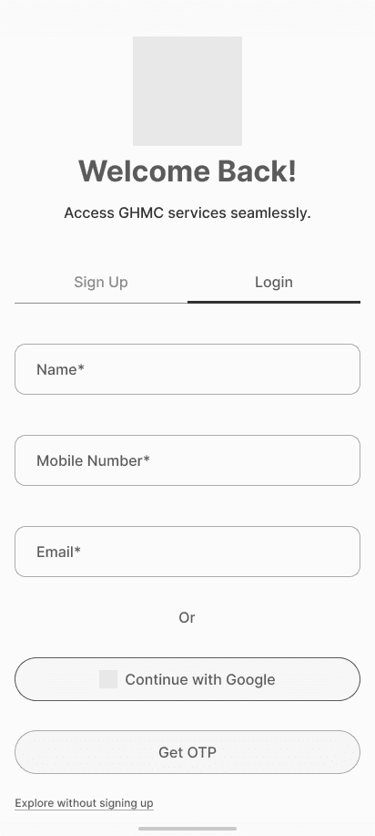
Digital wireframes made it easy to understand how the redesign could help address user pain points and improve the user experience. Prioritizing useful button locations and visual element placement on the home page was a key part of my strategy.
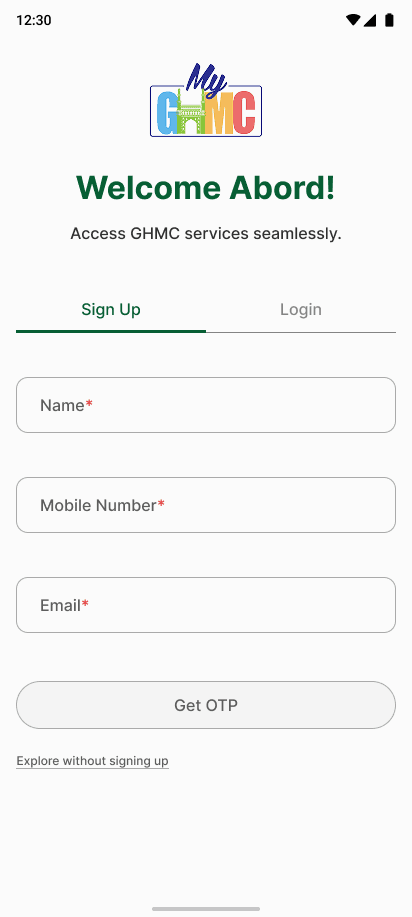
Why include Email in the Signup form?
In the original app, the signup process did not collect the user's email. However, I added this field as a thoughtful UX enhancement. Imagine a scenario where the user tries to log in but has poor mobile signal and cannot receive the OTP. By capturing the email during signup, the app provides an alternate login method, ensuring users can still access their account when mobile number verification fails. This improves accessibility, reliability, and reduces friction in critical moments.
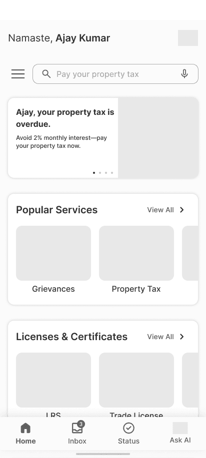
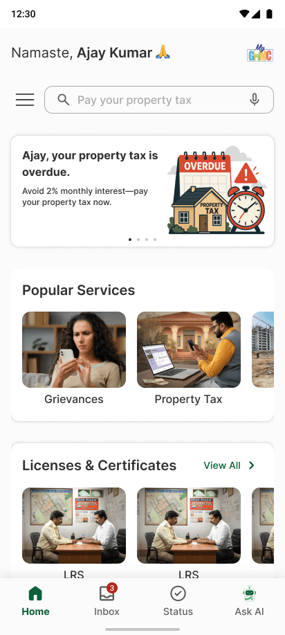
The original home screen was cluttered and hard to navigate. I redesigned it to feel clean, personalized, and focused.
Key Improvements:
1. Personalized greeting with relevant alerts.
2. Smart search bar with voice and chip suggestions.
3. Clean service categories like Grievances and Licenses.
4. Fewer icons, more clarity.
5. AI chatbot.
Usability study: findings from current app.
Search Confusion
Users struggled to locate services due to poor icon hierarchy and lack of search assistance.
Lack of Support
There was no clear way to ask for help or understand complex tasks, especially for first-time users.
Guidance Drop-offs
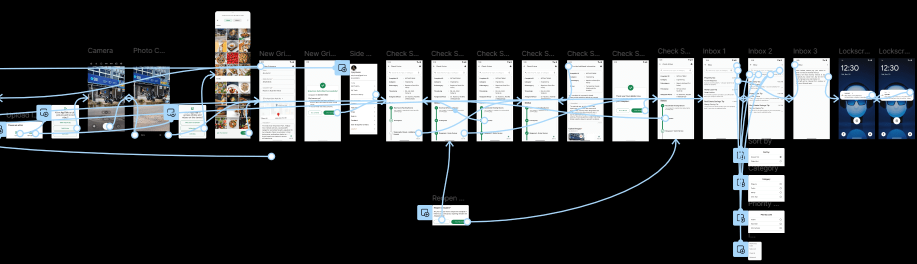
Steps like grievance submission lacked progress cues, guidance, or visual clarity, leading to drop-offs.
Visual Overload
The interface was cluttered with inconsistent icons, making the experience visually overwhelming.
Lack of Personal Focus
The homepage didn’t prioritize relevant services, alerts, or personalization, which diluted the user’s attention.
Limited Discoverability
Users were unaware of other useful government services due to poor app-to-app visibility.
Refining the design
Mockups
Improvement 1: Smarter Search with Voice & Suggestions
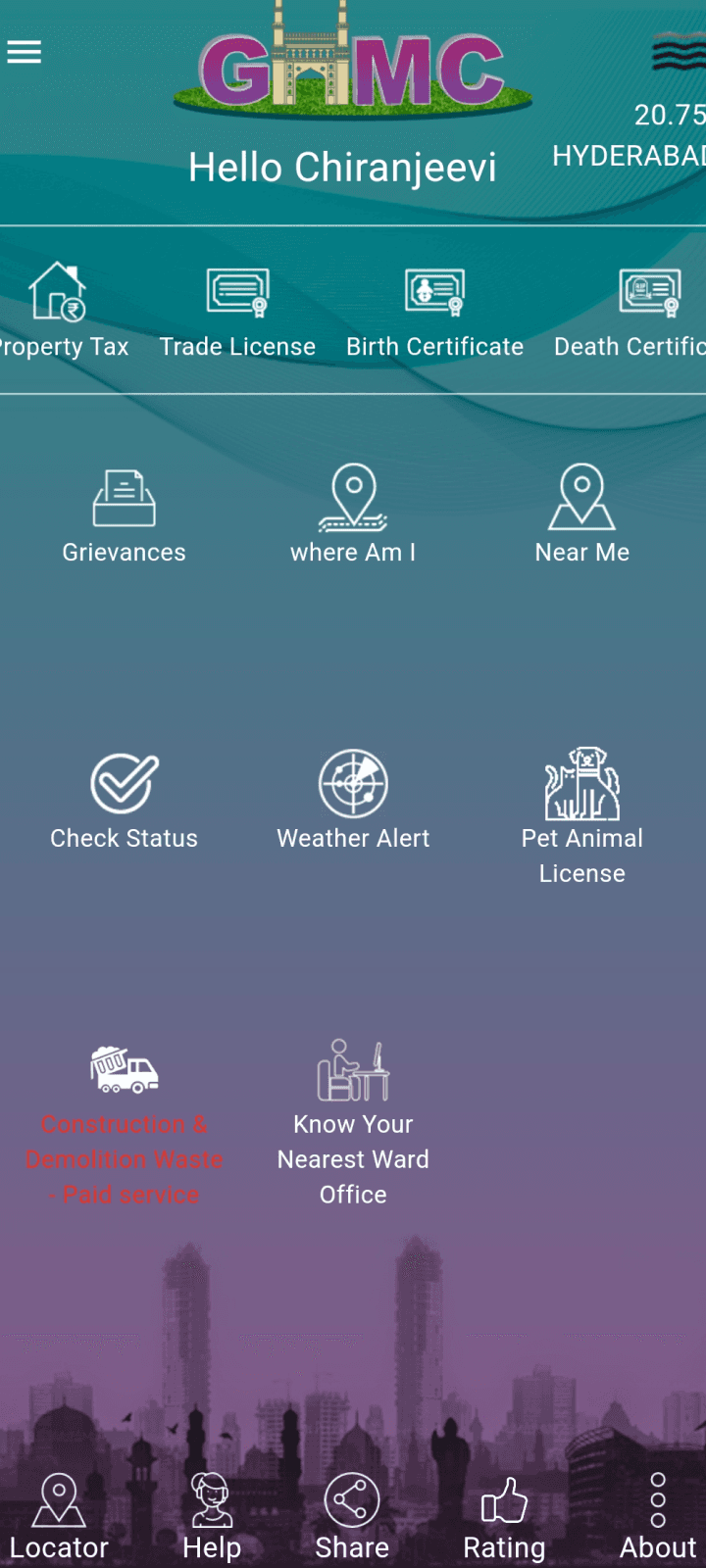
Before usability study:
Users had no clear way to locate services. The homepage was overcrowded with icons, leading to confusion and long scrolling.
After usability study:
I added a search bar with voice input and smart chips to help users quickly find services based on intent.
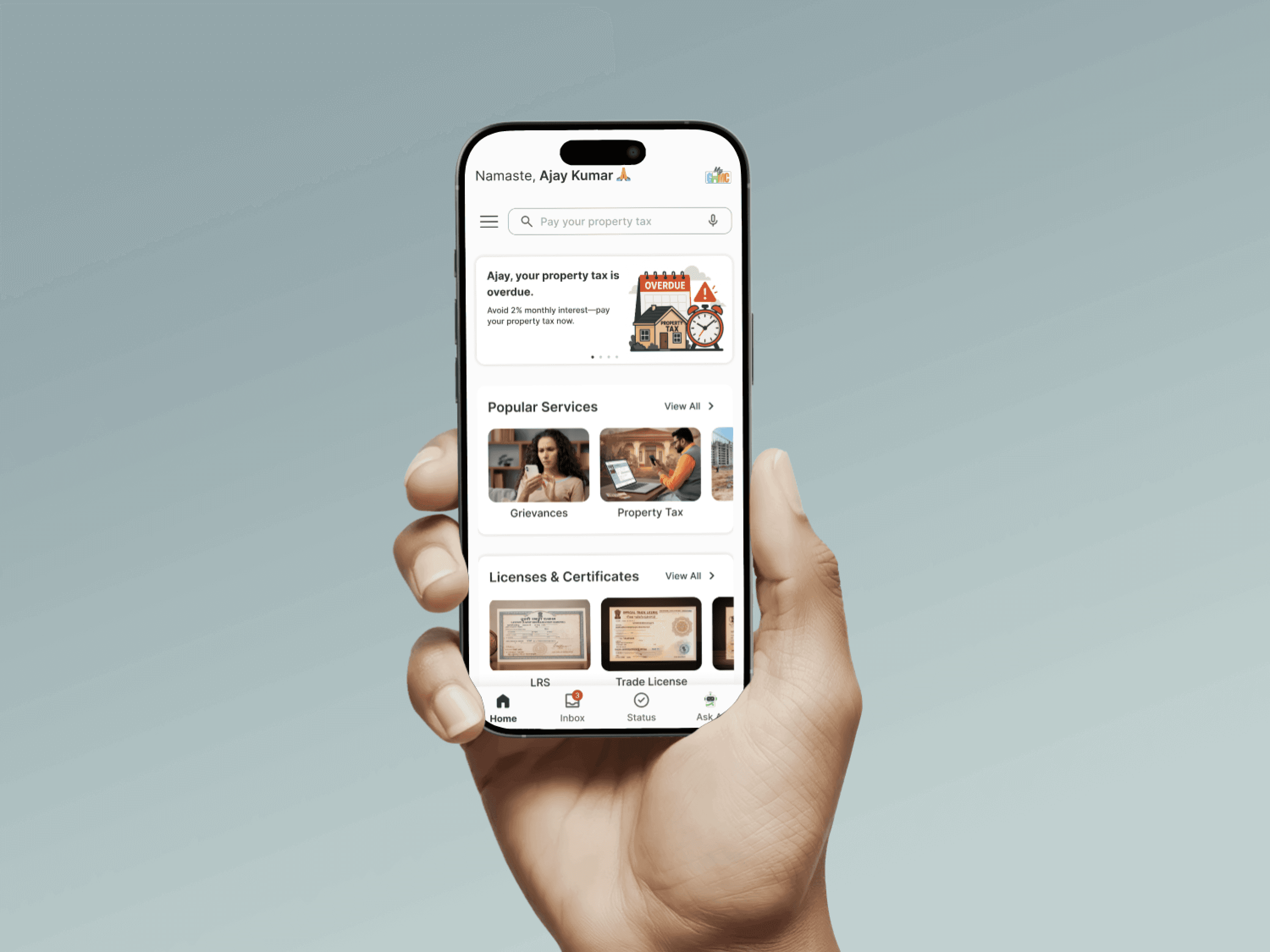
Impact: Made key services like Property Tax and Grievances easier to access, especially helpful for users with limited time or tech skills.
Improvement 2: AI Chatbot for Instant Assistance
Before usability study:
The app lacked support guidance. Users were unsure how to proceed with complex tasks like registering a complaint.
After usability study:
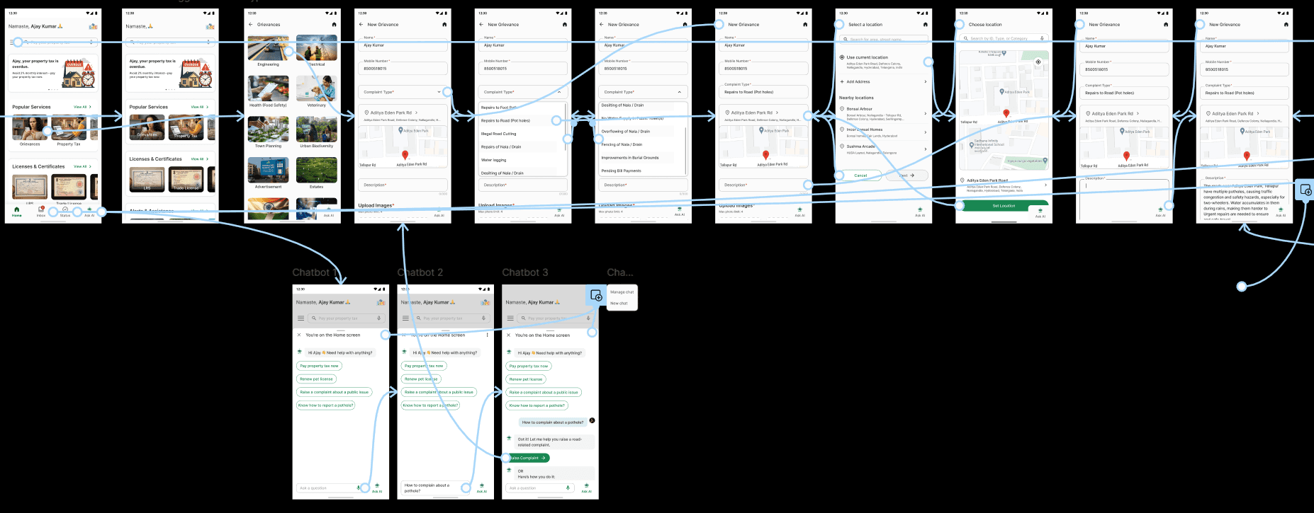
I introduced a contextual AI-powered chatbot that floats on every screen. It offers real-time help, guided flows, FAQs, and even auto-fills based on prior complaints.
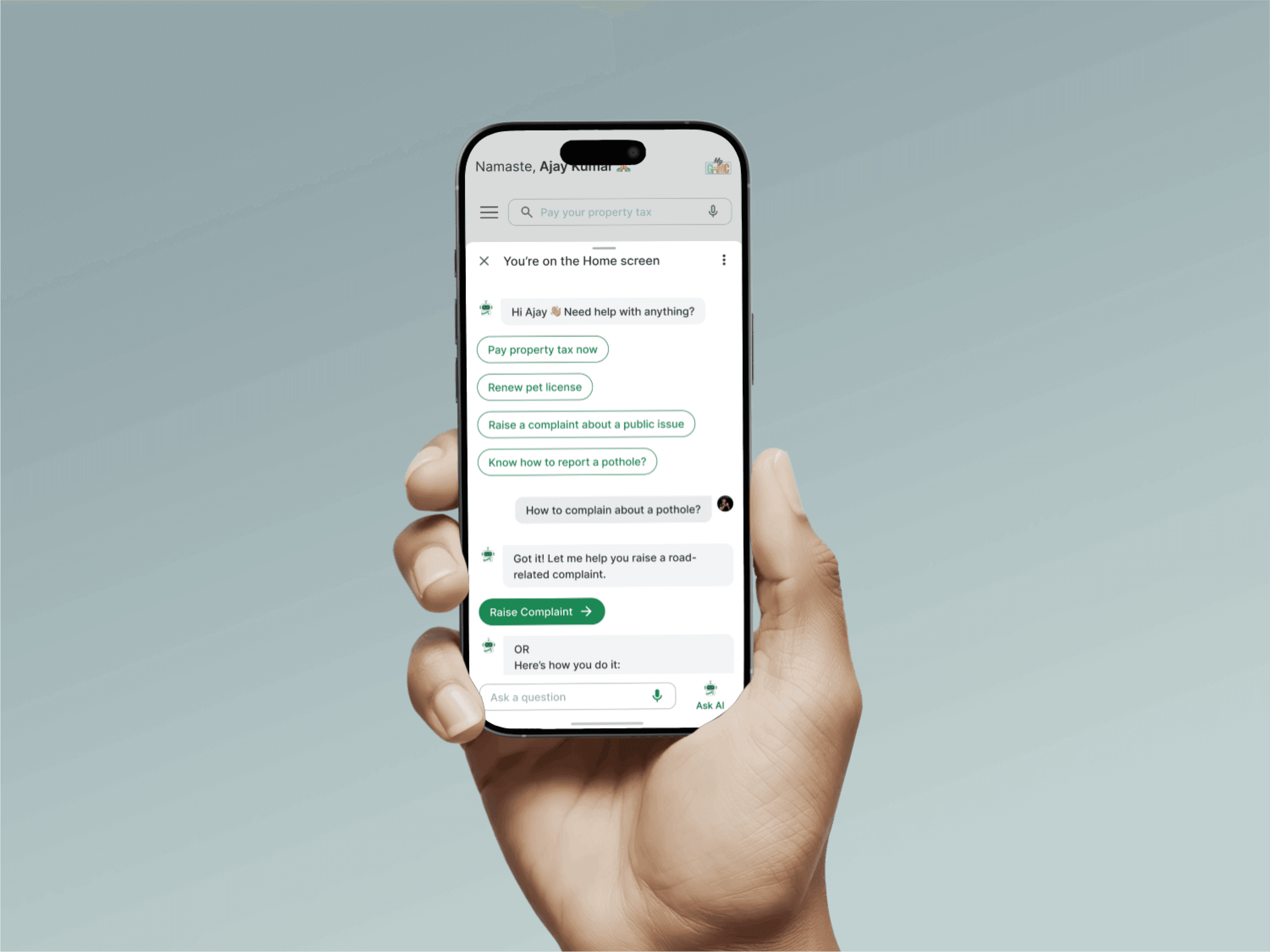
Impact: Reduced confusion, increased task completion, and made the app more inclusive for all users.
Improvement 3: Visual Hierarchy & Personal Focus
Before usability study:
The interface was cluttered with inconsistent icons and lacked personalized focus, making navigation overwhelming.
After usability study:
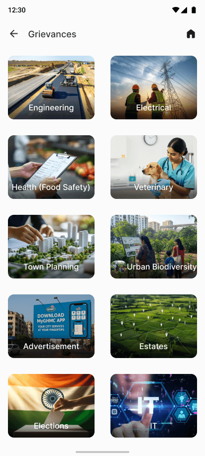
I replaced icons with image-based cards, introduced personalized greetings, and prioritized relevant sections like Grievances and Property Tax.
Impact: Created a more intuitive and modern experience that helps users focus on what matters most.
Improvement 4: Better Discoverability of Govt. Services
Users were unaware of other useful Telangana govt. and Indian govt. apps due to a lack of visibility or nudges.
After usability study:
I added two clear sections, “Other Apps from Telangana Govt.” and “Other Citizen Apps”—with cards and logos to nudge exploration.

Impact: Encouraged users to discover and benefit from additional e-Governance tools beyond just MyGHMC.

Accessibility considerations
High-Contrast Color Scheme
Used clear contrast between background and text (e.g., dark text on light backgrounds) to improve readability, especially for users with visual impairments.
Voice Input & Smart Suggestions
Enabled voice input in the search bar to support users with limited mobility or digital literacy.
Touch-Friendly Targets
Designed large buttons and cards for easy tap access on mobile devices, aiding users with motor difficulties.
AI Chatbot with Natural Language Support